

Three routes for Varech
Brand concept presentation for Sylvie Comeau, from Arsenault Boyle, Halifax. Wednesday 9 June 2027. Pick one by Friday 18 June.
You don't have a label problem
You have a provenance claim nobody can see. Every skincare brand on the shelf in Tokyo and Seoul will say the sea, and only Varech grows its kelp on lines you can point to.
Your Series A of C$6.8M closed in January, and it pays for three things: the second harvest lease off Lunenburg, a refill range, and first export in spring 2028. The current identity was built for a farmers' market and one website.
The platform we signed off in April says Varech sells proof. So we judged these routes on one question: does the design itself carry the proof, or does it need a paragraph on the back of the carton to do that?
Route A: Tide Line. Recommended.
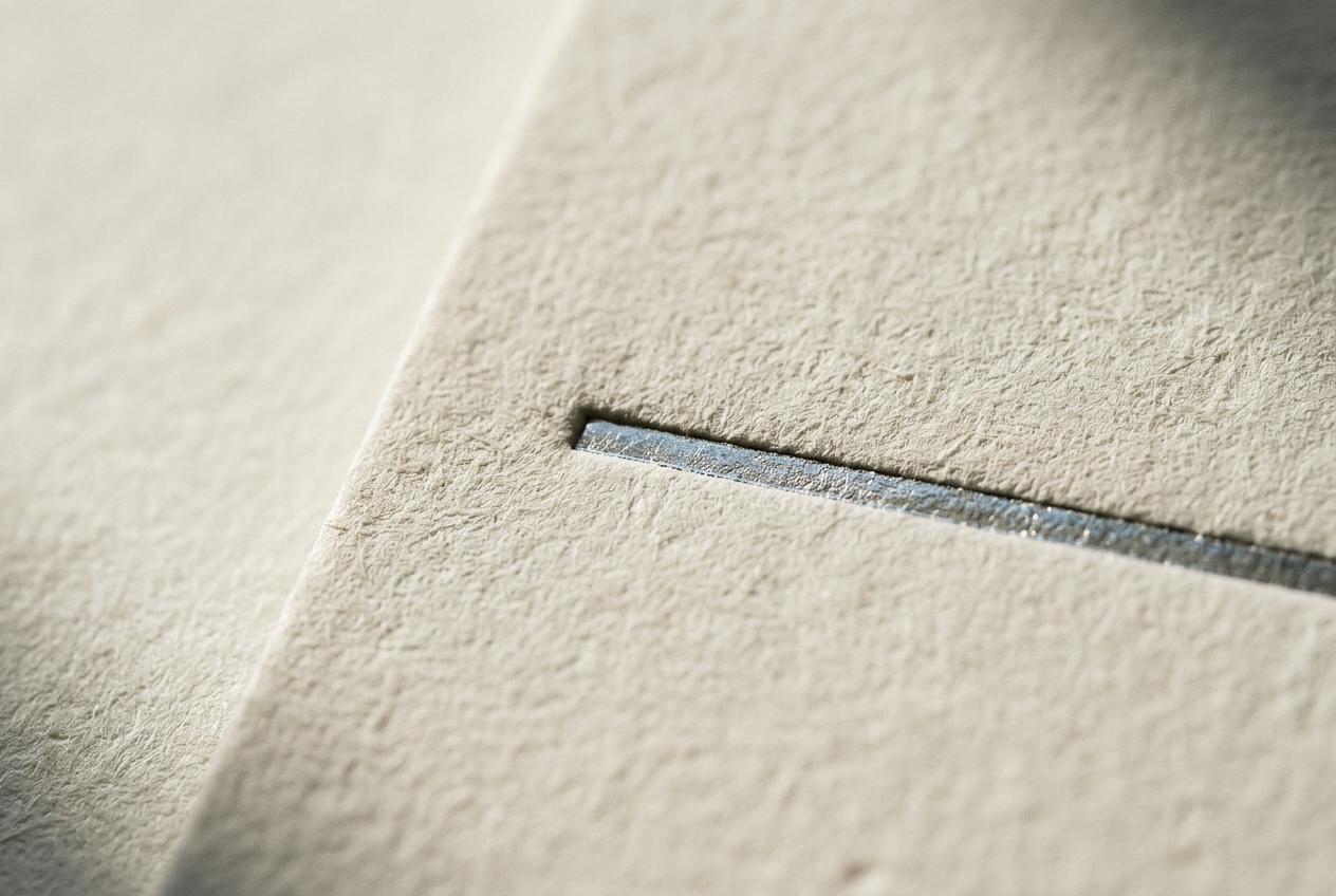
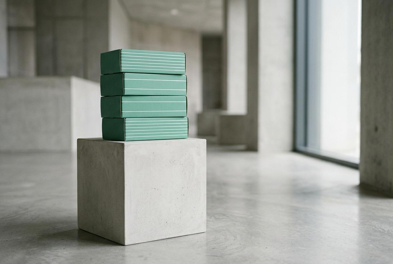
A variable wordmark whose weight follows tide height on harvest day, with one foil waterline on every carton set to that batch. No two runs match, and all of them read as Varech. It is the only route where the proof is the design.
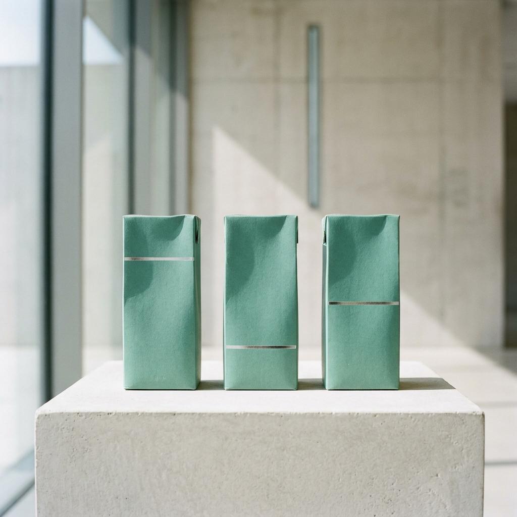
Route B: Cold Room
Lab white, brushed aluminium and one large batch numeral. It looks expensive and tested very well for trust in Seoul. It also looks like four brands you already compete with, and it needs a paragraph to say where the kelp comes from.
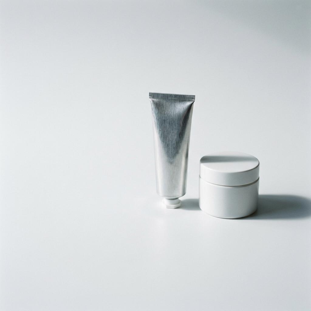
Route C: Blade
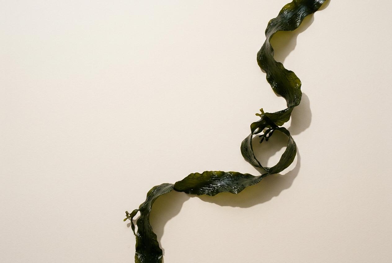
One continuous ribbon drawn from a kelp blade, running from wordmark to bottle shoulder to carton flap. The most beautiful of the three, and the one your team liked best. It says seaweed. It doesn't say yours, and a competitor could draw it next year.

Tide Line does the selling
Five places where the route has to work. Each one answers something in your brief, and each one has been built, not just described.
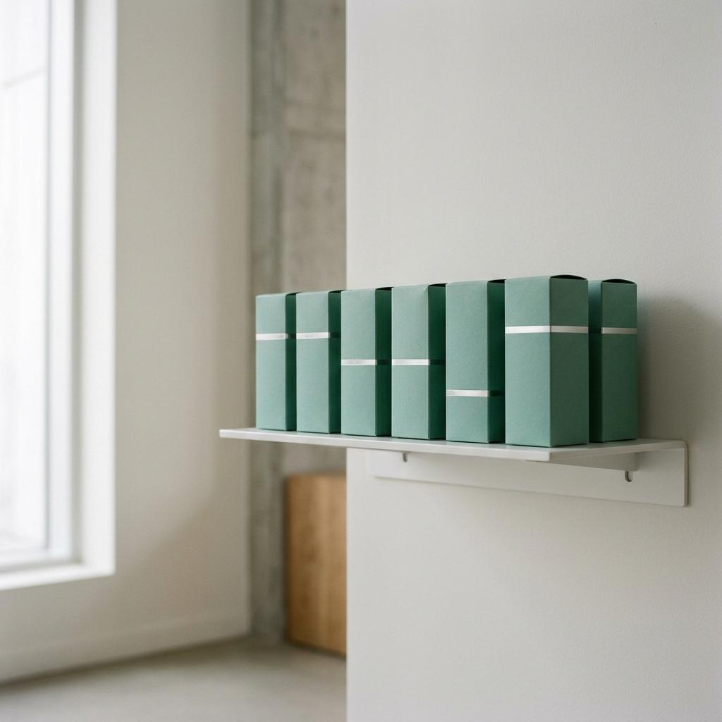
On a crowded shelf
The waterline is the one horizontal on a shelf full of vertical bottles. It reads from two metres away, and the height shift makes a row of cartons look alive. Buyers noticed the variation before we pointed it out.
On a phone first
Variable type means the wordmark animates to the live tide on your site and in vertical social. Most people will meet you on a 390 pixel screen. We designed for that first and worked out to the carton.

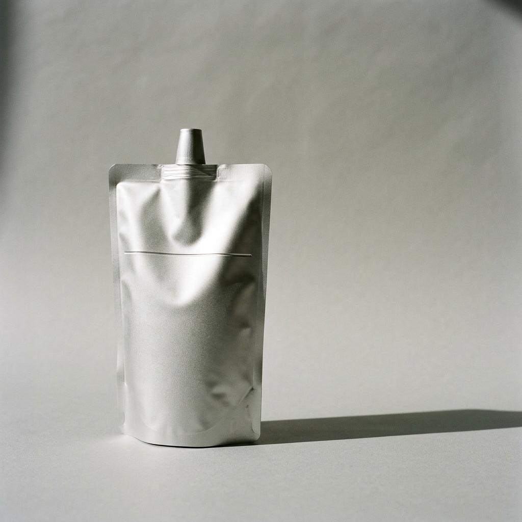
On a refill pouch
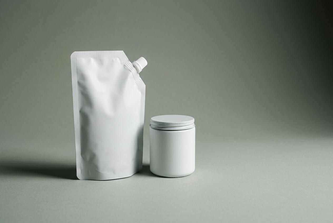
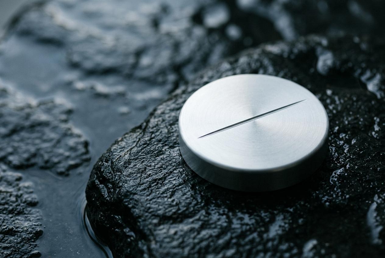
Refills lose the carton, so the line moves into a laser mark on the aluminium. It costs less than print, and it stays legible in a shower. The refill range launches with the same system at no extra design cost.
In Tokyo and Seoul
The line carries no language, so it travels without translation. Regulated copy sits in one panel, which we have tested in Japanese and Korean at legal minimum sizes. Your distributors have seen it and raised no objections.
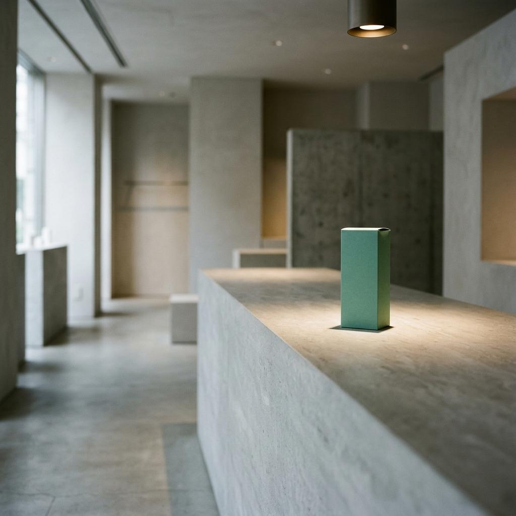
In motion and sound
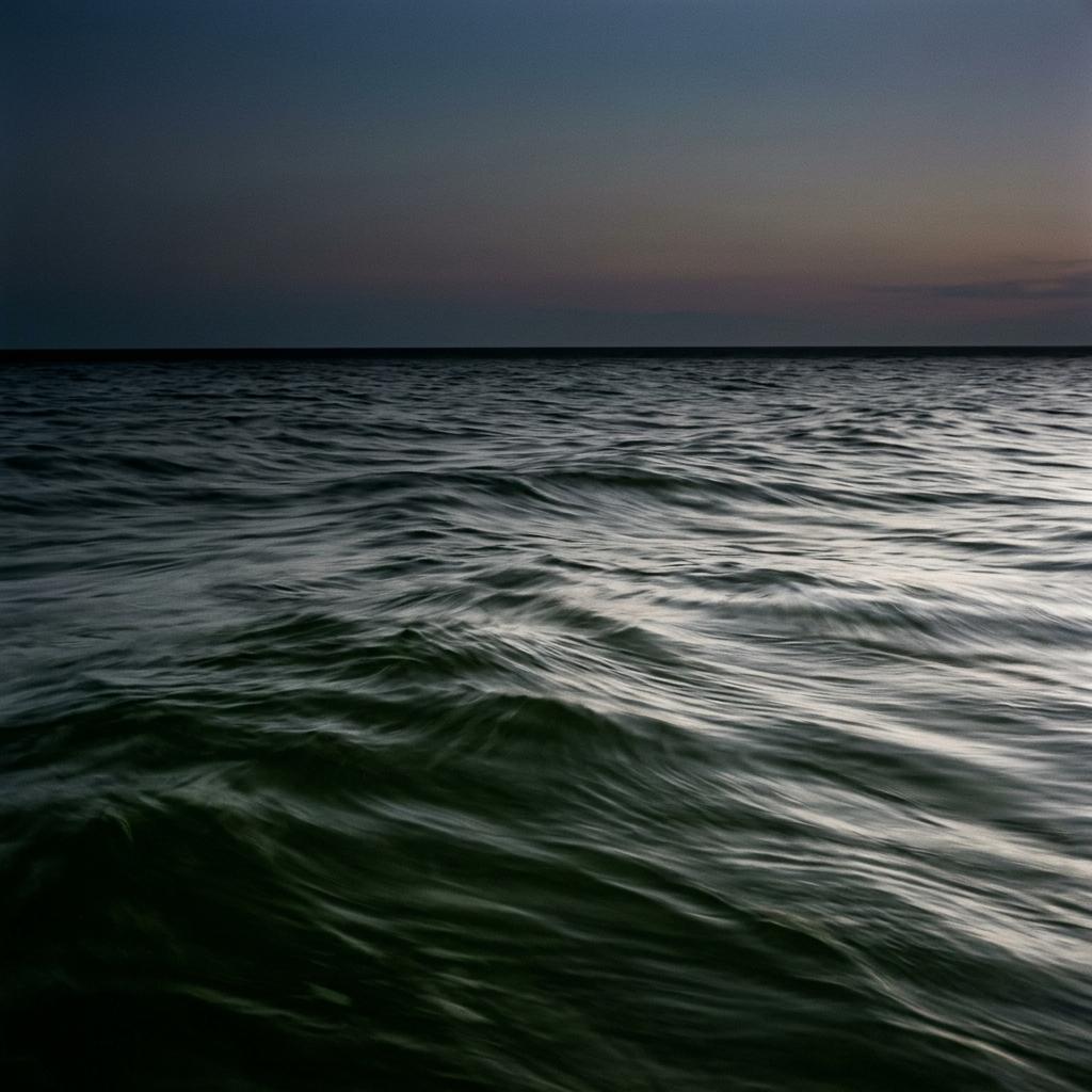
A slow rise and fall in the wordmark, four seconds, and a low sonic mark recorded from the harvest lines. It gives you a brand film opener and a Reels sign-off without commissioning anything new.
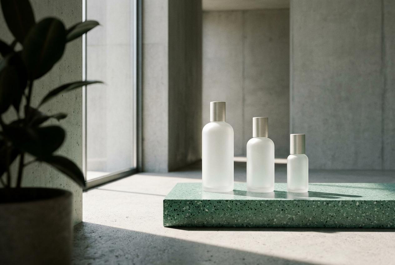
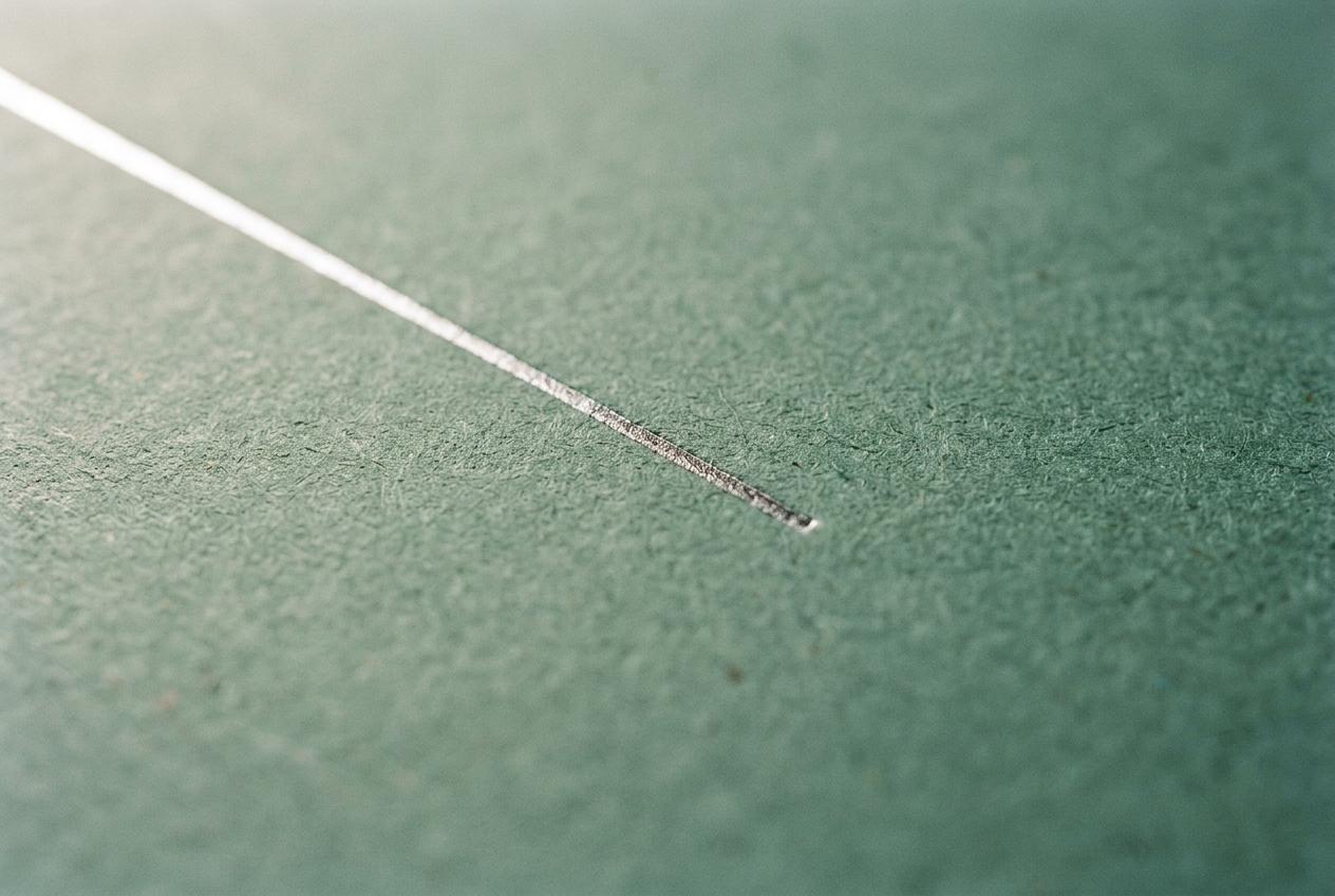
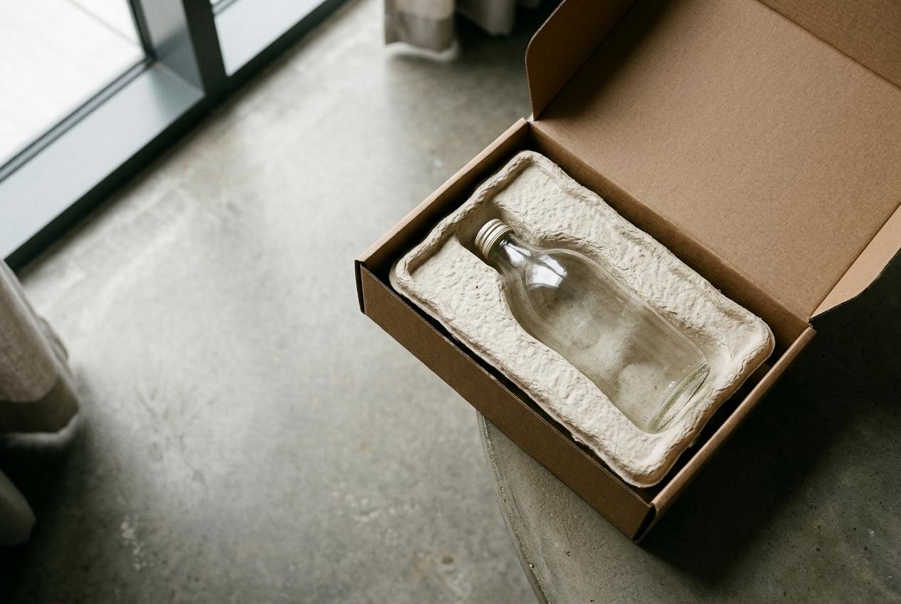
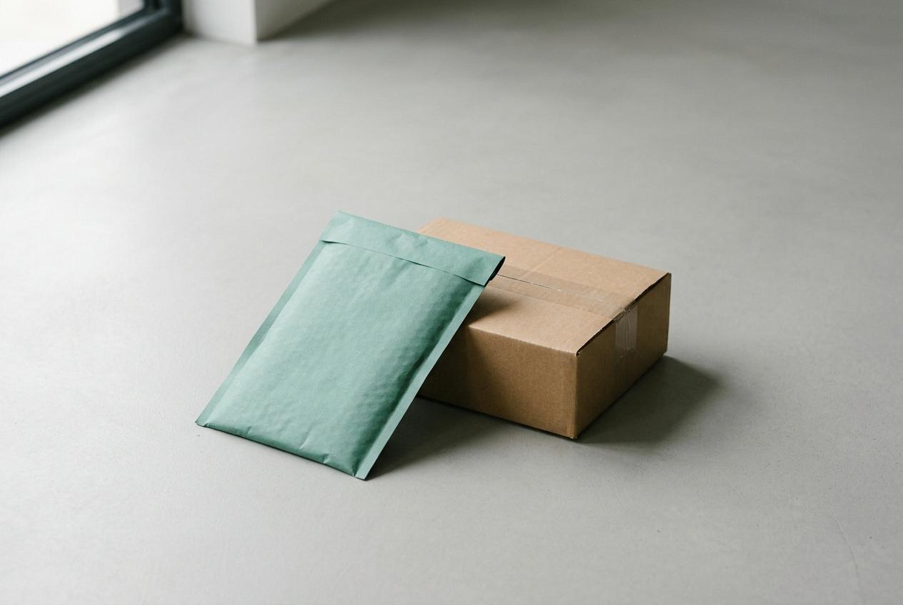
Tide Line, made real
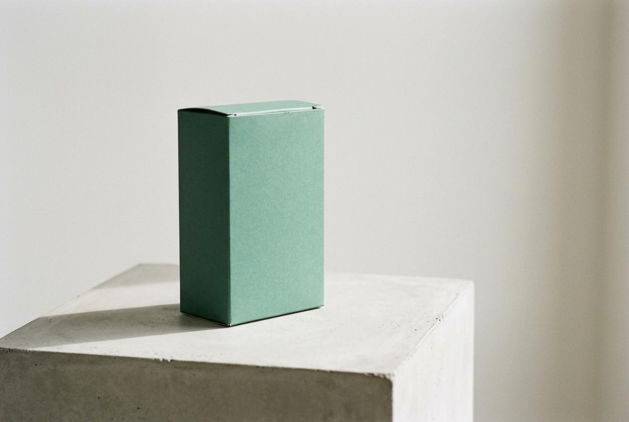
Prototypes from our studio and first proofs from your carton supplier. All are pre-refinement. The finishes are real, and the line weights will change.
The numbers back Route A
Online shelf test with 412 skincare buyers in Canada, Japan and South Korea, 24 to 28 May. Route A got 63% recall against 41% for your current carton. Route B scored 48% and Route C 52%.
0%
Recall at three seconds
0 mm
Smallest clean wordmark
0.0:1
Contrast on the carton
0%
Less carton ink
What Tide Line costs you
It has real costs. Better you read them here than meet them in production.
Batch data has to reach the printer
Each carton run needs that batch's tide height before it goes to press. Your operations team would send one number per harvest, around 26 a year. We will build the template and the file naming, but somebody at Varech has to own the number. If you miss it, the run prints on a default height and loses the point.
Short print runs cost more
Changing the foil plate per batch adds about 6% per carton at your current volumes, based on a quote from your carton supplier. Digital foil at 40,000 units a year removes most of that. We think it is worth paying. It is your margin, so it is your call.
Licensing and trademark
The variable font license is a client cost, quoted at C$4,180 for web, app and packaging. Trademark screening in Canada, Japan and South Korea sits with your counsel. Do that before refinement closes, because the wordmark is what they file.
What is fixed and what can still move
Fixed once you approve: the route, the waterline device and the type family. Still open: line weights, colour values, carton structure and the sonic mark. We include two rounds of refinement. A third is possible, at C$6,920, and it moves master artwork by two weeks.
If you prefer Route B or C
We would build either properly, and the dates below stay the same. We would then ask you to pay for provenance another way, likely a film and a page of copy, because neither route carries it on the shelf.
Choose by 18 June. Then we move.
Spring 2028 export means cartons on press by November. These dates assume consolidated feedback within three working days of each round.
Round one, 6 July
Line weights, colour values and the first carton structure, shown at full size with the wordmark live on your staging site.
Round two, 27 July
Final refinement, including Japanese and Korean panels. Your counsel's trademark comments need to reach us before this date.
Press check, 20 August
Digital foil trial with your carton supplier in Dartmouth. Nadine attends. We test contrast and legibility on the real board.
Master artwork, 14 September
Print-ready dielines, the Figma toolkit, the motion and sonic files and the brand portal. Your operations team gets its handover the same day.
Sign for Tide Line by 18 June
We recommend Route A, and we'd stake the project on it. If you choose differently, tell Nadine by the same date and we will reissue this page for that route. Nothing starts until one of you signs.
Prepared by
Nadine Arsenault Creative Director, Arsenault Boyle
3rd Floor, 1871 Hollis Street Halifax NS B3J 1W9 nadine@arsenaultboyle.ca
For approval by
Sylvie Comeau Co-founder and CEO, Varech
Lunenburg, Nova Scotia sylvie@varech.ca
Approve Route A, Tide Line
By signing, you approve Tide Line as the identity route for refinement. The agreed fee of C$86,250 plus HST does not change. We will issue the third stage invoice of C$25,875 plus HST and start round one on 21 June.